

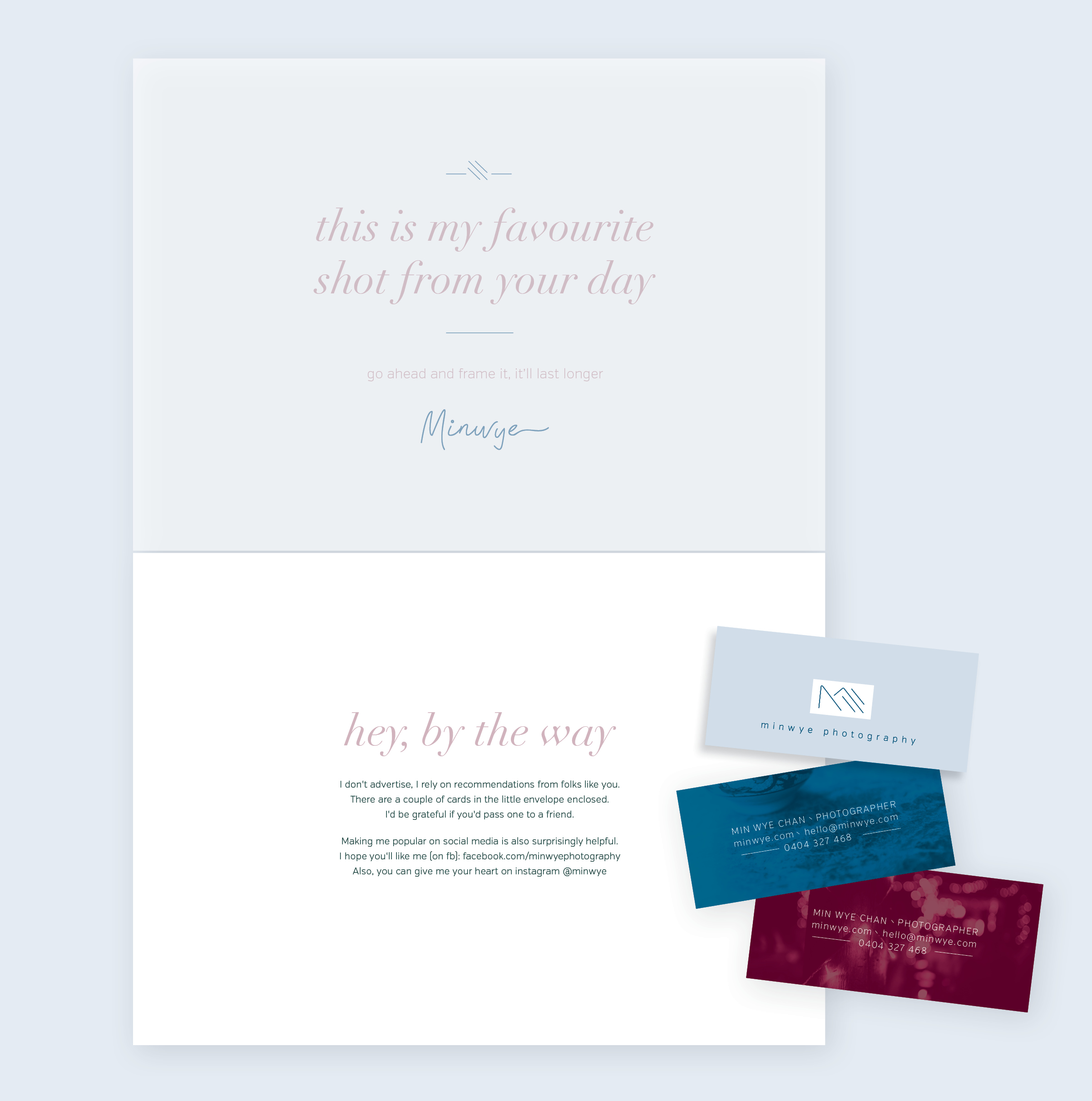
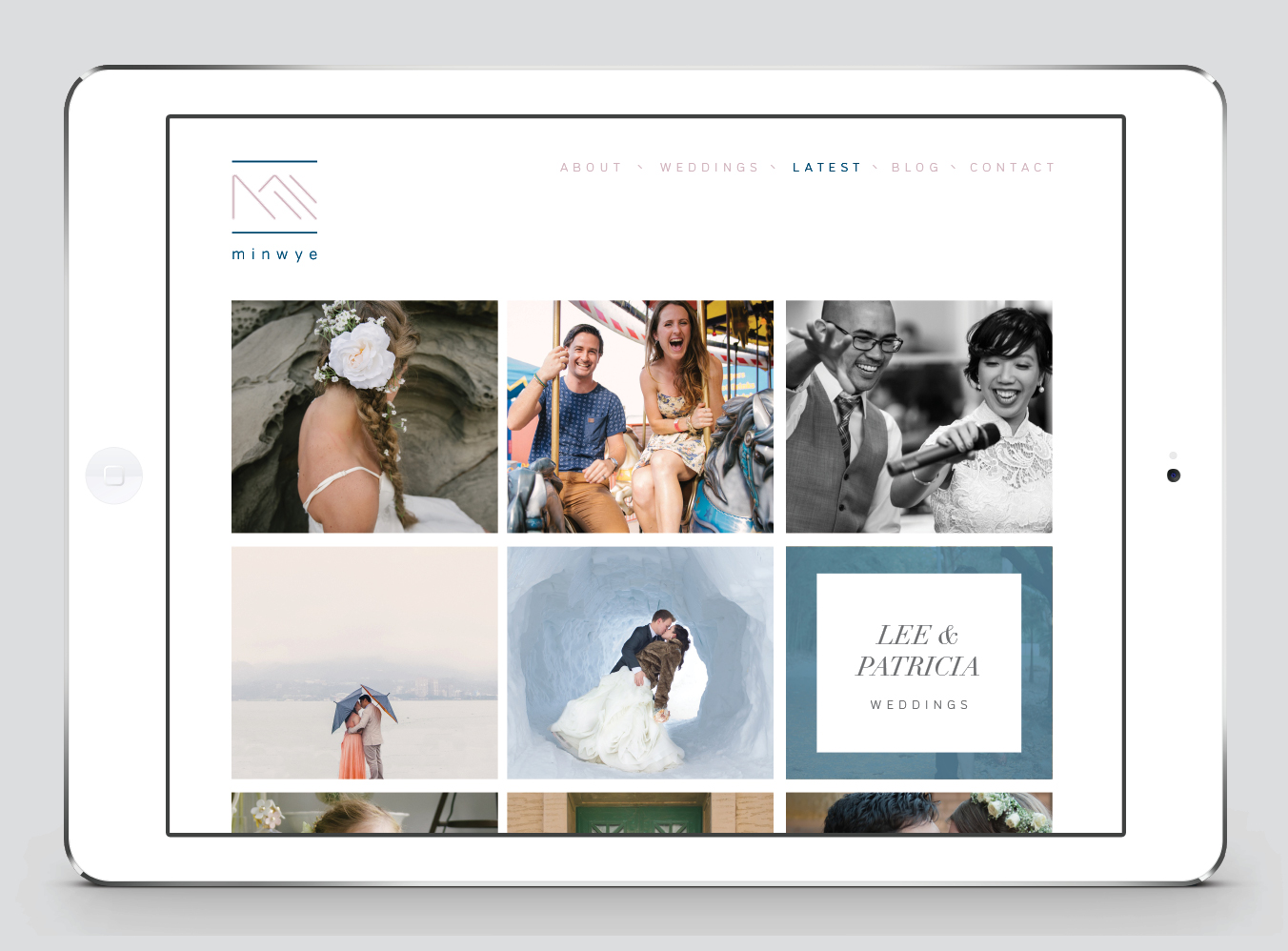


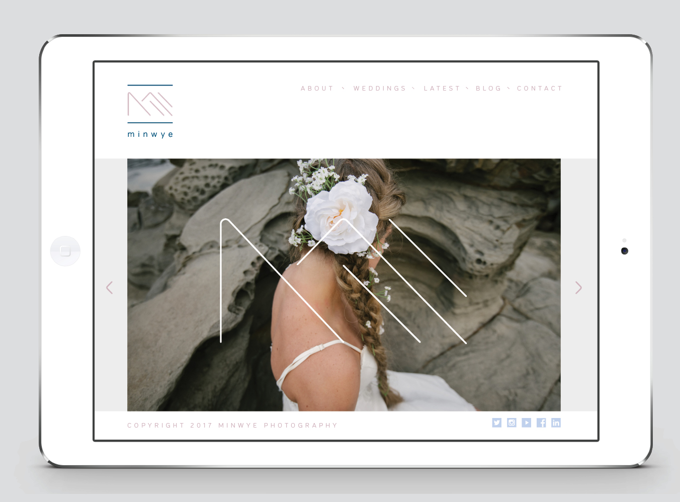

wedding and commercial photographer brand identity and interface design
Minwye Chan is a photographer in high demand. He does not need to advertise his work or persuade his clients. Every job he takes on is referral based and is undoubtedly testament to his inimitable style. Min sees the most curious details, the most interesting composition opportunities, and he produces brilliance in his own quiet, meticulous way.
These qualities inspired the creation of Min’s logo mark (if looked at from different angles, the ‘M ’ can be seen to show every letter of his name, Minwye). The web interface, typography and colours are suitably restrained, providing an elegant frame for his work. This brand design will remain relevant for many years to come, as it is a reflection of his work, his personality and his subtle, unique charm.