Construction firm brand identity
Strategic positioning of new market presence
![]()
![]()
![]()
![]()
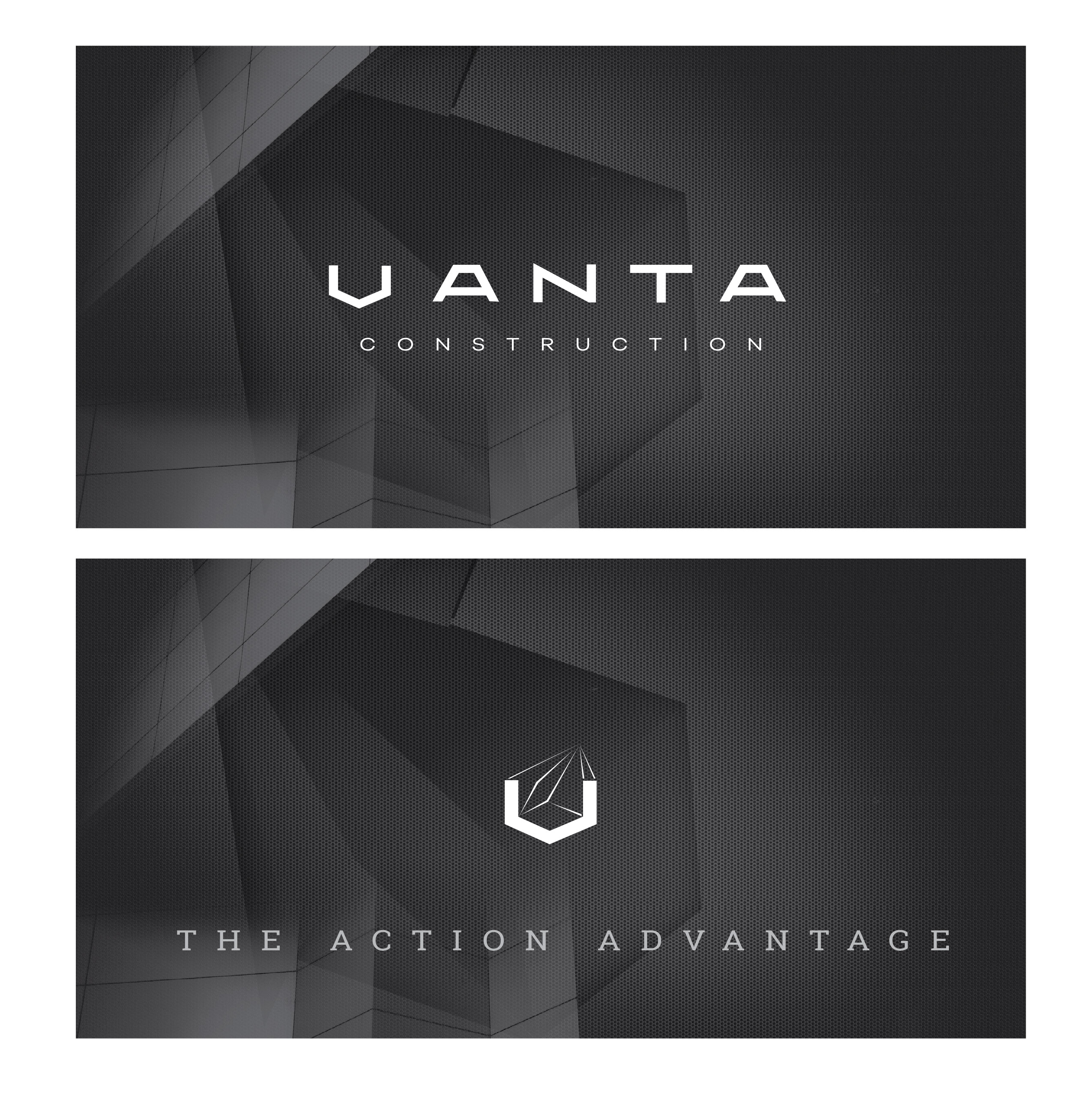
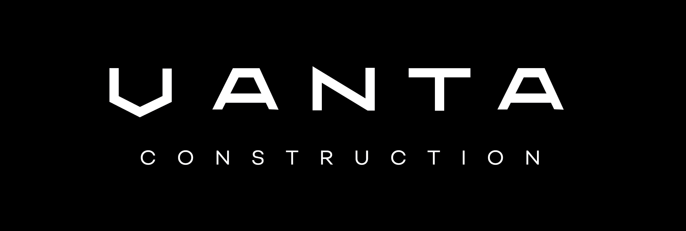
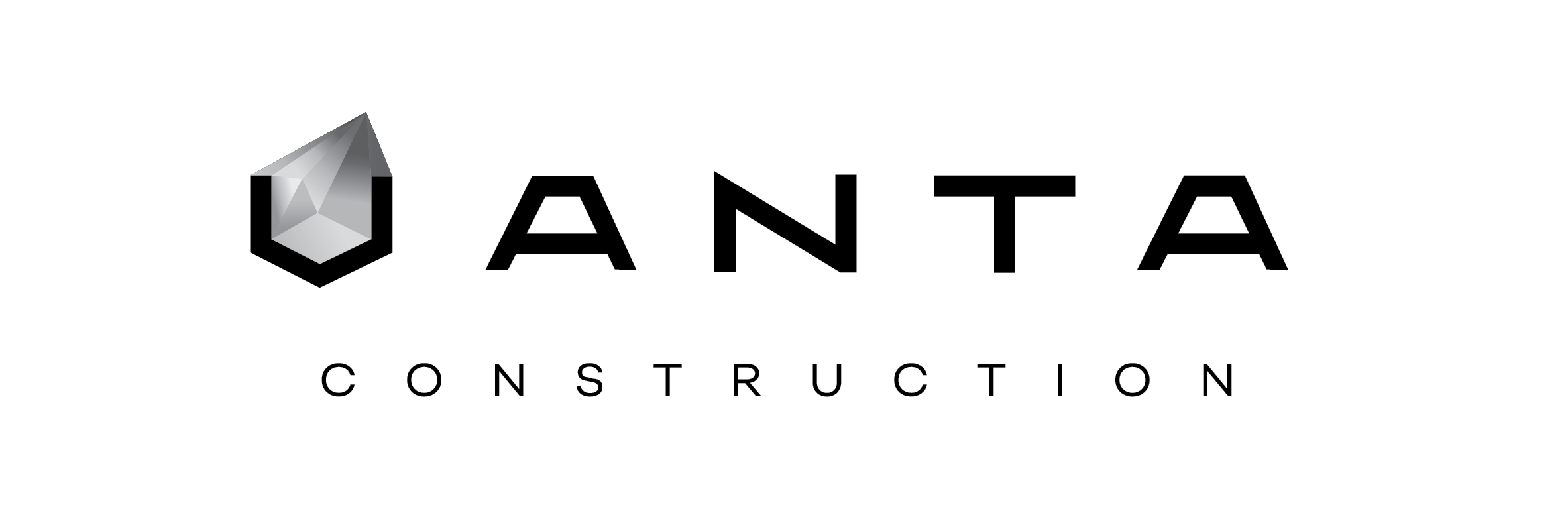
What is blacker than the black? The darkest black percievable by the human eye, and an innovation that inspired the name of this Melbourne-based construction firm. The reflective prism shape seen in the V and forming the basis of the logotype letterforms is derived from the molecular structure of the vantablack colour itself. The angles and associated structures complete the brand’s association with the built form, achieviement and superior quality.
Disciplines: brand development / logo design/ custom lettering / web design / print design
Strategic positioning of new market presence


What is blacker than the black? The darkest black percievable by the human eye, and an innovation that inspired the name of this Melbourne-based construction firm. The reflective prism shape seen in the V and forming the basis of the logotype letterforms is derived from the molecular structure of the vantablack colour itself. The angles and associated structures complete the brand’s association with the built form, achieviement and superior quality.
Disciplines: brand development / logo design/ custom lettering / web design / print design